Drupal promotional materials
By kika at 28/06/2004 - 00:28 | Design | Drupal | English
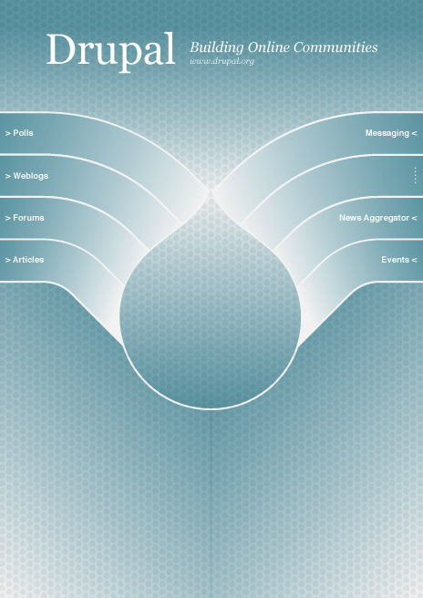
[image:189,right]I just completed the promotional materials for Drupal project,
attending its first large-scale IT venue, LinuxTag in Germany.
The promotional set consists of the brochure (PDF)
and the poster (PDF).
You can see these materials on this picture, capturing the action in the venue-booth.
Two lessons learned in this project:
- Remote collaborative development model, used in Drupal programming, does
not work in graphic design. Graphic design requires a whole new set of tools
making this sort of workflow run smoothly. We used the mix of IRC, mailing lists
and project management software, but it all turned out clunky and slowed the
design process down seriously. (At the same time, the whole Drupal crew was
really supportive and a joy to work with. Thank you!)
- Cutting-edge transparency features present in InDesign are not always supported
by the print houses. The problematic procedure is called flattening and it seems
that the German print house we used was not able to interpret the printfile
correctly. The ugly side-effect of this are the black bands on the poster background
(it was not a part of the original design).
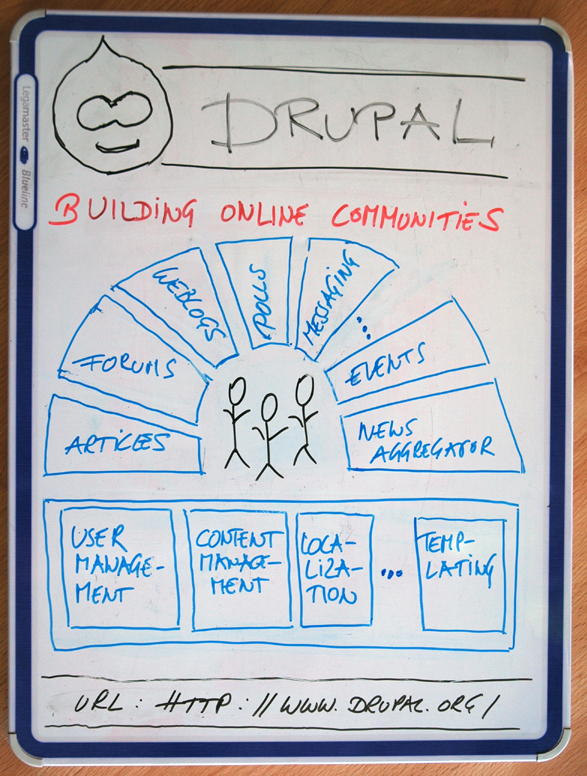
Update: Faults mentioned above seem not to be InDesign fault as Gerhard (the
guy with Drupal brochures in his pocket) explains.
From: killes <mailto:drupal-devel@DOMAIN.HIDDEN>
Date: Tue, 15 Jun 2004 18:48:54 +0200

Project:      Drupal
Version:      cvs
Component:    base system
Category:     tasks
Priority:     normal
Assigned to:  Anonymous
Reported by:  killes@xxxxxxxxxxxx
Updated by:   killes@xxxxxxxxxxxx
-Status:       active
+Status:       patch
Attachment:   http://drupal.org/files/issues/kika.drupal.booklet.3.diagram.png
(0 bytes)

Kika sent me his next sketch.

I am very greatfull for his support.

I'd like you all to give helpfull comments. We have now 41 hours left
till the leaflet needs to be at the printer's shop.

killes@xxxxxxxxxxxx

Previous comments:
------------------------------------------------------------------------
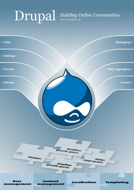
June 14, 2004 - 20:24 : Dries
Some initial thoughts:
Joep/Ber's proposal [1] looks nice visually, but (i) communicates
almost nothing and (ii) does not present all required information. It
is incomplete and therefor difficult to evaluate. My original mockup
[2] is visually less appealing, but at least it clearly communicates
Drupal's architecture, modularity and functionality.
The suggested leaftlet information [3] often emphasises on the wrong
features (eg. the 'collaborative book' is the first entry which makes
it the most important one -- not so) and even lists irrelevant information
(eg. information about Druplicon). Furthermore, the list
is a mixture of 'features' (eg. news aggregation) and 'properties' (eg.
scalability).
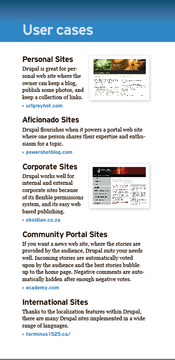
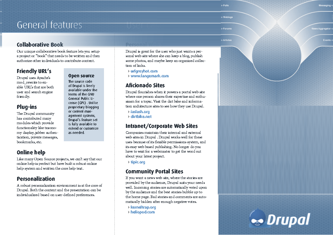
Kika's use cases [4] are the best material I've read so far. It
communicates what Drupal can do in a solution driven manner without
becoming a long-winded list of features and properties. The
screenshots are too small though. 'Aficionado site' is a weird
(uncommon) description -- aren't all websites centered around a topic,
person or interest? I'd change 'community portal site' to 'community
site' and I'd add 'news site' and maybe even 'campaign site'
(grassroots organizing).
[1] http://drupal.org/files/issues/Drupal_poster_proposal_01.jpg
[2] http://buytaert.net/temporary/drupal-poster.jpg
[3] http://drupal.org/files/issues/drupal-leaflet.folded_0.pdf
[4] http://drupal.org/files/issues/kika.drupal.booklet.2.usercases.png
------------------------------------------------------------------------

June 14, 2004 - 13:33 : kika

Attachment: http://drupal.org/files/issues/kika.drupal.booklet.2.usercases.png
(29.05 KB)

As we are running out of time, I am creating the leaflet page-by-page
basis.

I dropped coyrighted fonts and using freely downloadable ones

* Georgia: http://simplythebest.net/fonts/fonts/georgia.html * Hit the Road
(freeware clone of Interstate)
http://www.dafont.com/en/theme.php?cat=501&page=4

Here's the page 1/6 of leaflet: User cases

I'll post text to ML for review, it needs work!


------------------------------------------------------------------------

June 14, 2004 - 11:00 : killes@xxxxxxxxxxxx

I have just received the booth plan. If I read it right we are in the
neighbourhood of Gentoo, Gnome, FreeBSD, fli4l, Free Video and
something called Squeak.

We really need to get cracking. The leaflet should be finished asap. If
Dries does not appear any time soon we need to decide without him. The
leaflets should see a printer really soon now. The poster is less
urgent as I will print that locally. But then again both things should
be designed the same way so we should settle for a design and on the
next. Yes, I am getting nervous.

I'll be available in #drupal for the rest of the day, but probably not
much of the night. I will get a quote for the leaflets later today.

------------------------------------------------------------------------

June 14, 2004 - 09:39 : killes@xxxxxxxxxxxx

Attachment: http://drupal.org/files/issues/drupal-leaflet.folded_0.pdf (20.95
KB)

Sprry, I had not checked that the ps2pdf conversion did work...

Here is the updated PDF.

My remark about Druplicon was actually to test if somebody had read the
leaflet. ;)

I hope that the people art LinuxTag are bright enough to use the info
address in a usefull way. We will also list the forums and the mailing
list. But you have to registerfor the forum and the ML is probably
closed for non-members so we should have a simple email address, too.
------------------------------------------------------------------------
June 14, 2004 - 11:00 : killes@xxxxxxxxxxxx
I have just received the booth plan. If I read it right we are in the
neighbourhood of Gentoo, Gnome, FreeBSD, fli4l, Free Video and
something called Squeak.
We really need to get cracking. The leaflet should be finished asap. If
Dries does not appear any time soon we need to decide without him. The
leaflets should see a printer really soon now. The poster is less
urgent as I will print that locally. But then again both things should
be designed the same way so we should settle for a design and on the
next. Yes, I am getting nervous.
I'll be available in #drupal for the rest of the day, but probably not
much of the night. I will get a quote for the leaflets later today.
------------------------------------------------------------------------
June 14, 2004 - 09:39 : killes@xxxxxxxxxxxx
Attachment: http://drupal.org/files/issues/drupal-leaflet.folded_0.pdf (20.95
KB)
Sprry, I had not checked that the ps2pdf conversion did work...
Here is the updated PDF.
My remark about Druplicon was actually to test if somebody had read the
leaflet. ;)
I hope that the people art LinuxTag are bright enough to use the info
address in a usefull way. We will also list the forums and the mailing
list. But you have to registerfor the forum and the ML is probably
closed for non-members so we should have a simple email address, too.
------------------------------------------------------------------------

June 13, 2004 - 23:00 : Steven

Parts are missing on the left and right when I view it here so I can't
comment on everything.

The only thing I noticed is:

"Druplicon is our hero. His malicious smile represents the developers'
view on the world."
To me this sounds the same as "Drupal is a malicious product" or
"Drupal developers are antisocial jerks"
Maybe 'mischievous' is a better word?

Also, maybe having the info@xxxxxxxxxx address in it is not such a good
idea: as far as I know, only 4 people get those mails, plus even now we
often get questions there that should go on the forums or mailinglists
instead ('can Drupal do this?' 'I can't get this module to work' etc).

------------------------------------------------------------------------

June 13, 2004 - 16:00 : killes@xxxxxxxxxxxx

Attachment: http://drupal.org/files/issues/leaflet.tar.gz (2.9 KB)

Here is the LaTeX source of my sketch, in case somebody wants to play
with it.

------------------------------------------------------------------------

June 13, 2004 - 15:52 : killes@xxxxxxxxxxxx

Attachment: http://drupal.org/files/issues/drupal-leaflet.folded.pdf (20.91 KB)

(I dare to set this to "patch" such that it is also sent to the ML, the
next poster should probably change this again.)

I've tried to come up with some nice texts for the leaflet. Please let
me know what you think.

------------------------------------------------------------------------

June 12, 2004 - 15:22 : Ber Kessels

Attachment: http://drupal.org/files/issues/leaflet_meets_poster_03.png (300.92
KB)

Everyone agrees that the poster and the leaflet should look like one
another.

So i took some time and made a real quick n ugly mockup from the
leaflet. I tried to merge the poster into it, slightly.

Next task would be to modify the poster so that it will look like the
leaflet more!


------------------------------------------------------------------------

June 10, 2004 - 21:09 : bertboerland@xxxxxxxxxxxx

Reading all above, we need a marketing department to make sure all
drupal related stuff looks the same and can be re-used; leaflets,
posters, text on drupal, pressreleases etc should all be taken care by
one role (person), just like
http://www.mozilla.org/projects/marketing/. I'll file a feature
request.

------------------------------------------------------------------------

June 10, 2004 - 18:59 : Anonymous

Hello,

I am Joep and I designed the Drupal poster. I was wondering, I want to
"sell" my poster offcoarse, if even the headers could be created with
the Georgia typeface. If you look at the poster then both 'Drupal' and
the slogan are Georgia, one regular and one italic. Not even do I
really like the typeface its look, I also think it is more 'corporate'
then the typeface used in the leaflet. I don't find it a good typeface,
but that's my oppinion.

I like the leaflet, it is good. But... yes I am sorry... it is just
that, it's good. I don't know if the approach to future clients need to
be showing that drupal is different in a way.

Again that is my oppinion. What do you think?

I will change the size of the text, good point.
------------------------------------------------------------------------
June 10, 2004 - 21:09 : bertboerland@xxxxxxxxxxxx
Reading all above, we need a marketing department to make sure all
drupal related stuff looks the same and can be re-used; leaflets,
posters, text on drupal, pressreleases etc should all be taken care by
one role (person), just like
http://www.mozilla.org/projects/marketing/. I'll file a feature
request.
------------------------------------------------------------------------
June 10, 2004 - 18:59 : Anonymous
Hello,
I am Joep and I designed the Drupal poster. I was wondering, I want to
"sell" my poster offcoarse, if even the headers could be created with
the Georgia typeface. If you look at the poster then both 'Drupal' and
the slogan are Georgia, one regular and one italic. Not even do I
really like the typeface its look, I also think it is more 'corporate'
then the typeface used in the leaflet. I don't find it a good typeface,
but that's my oppinion.
I like the leaflet, it is good. But... yes I am sorry... it is just
that, it's good. I don't know if the approach to future clients need to
be showing that drupal is different in a way.
Again that is my oppinion. What do you think?
I will change the size of the text, good point.
------------------------------------------------------------------------

June 9, 2004 - 14:41 : kika
Kika: what are the names of the fonts you used? Are they OSS? Can you
share a copy otherwise, or choose another one?
I used (c) fonts :(
"Minion Pro" for text, various fonts from "Dax" family for headers.

I think we can safely redesign the leaflet using free webfonts coming
free with MS products an also available for download:

http://simplythebest.net/fonts/fonts/trebuchet_ms.html (for headers)
http://simplythebest.net/fonts/fonts/georgia.html (for body)
Killes: You wnat an EPS: should that be a photoshop eps or illustrator eps.
note that a photoshop eps can be opened on most platforms, so can an illustrator.
An illustrator EPS, however, cannot be edited.
IHMO you got it wrong. photoshop eps is a bitmap with a lo-res preview
image and a an optional cutout path, illustrator eps contains mostly
vectors (with optional images). Does you software or platform opens and
renders these, is really an application-specific feature.
The one and only standard for prepress is an PDF (essentially a packed
and optimized eps).

BTW, when choosing a printer, Gerhard should ask for a "CMYK ICC

profile" in order to provide a best color for final result.
Kika/others: Do you have the Drupal logo word in EPS/vector
I used the same what comes with Drupal package, it is located in /misc
dir
------------------------------------------------------------------------

June 9, 2004 - 00:59 : Ber Kessels

After some discussion/talk here are some ideas:

Kika: what are the names of the fonts you used? Are they OSS? Can you
share a copy otherwise, or choose another one?
Killes: You wnat an EPS: should that be a photoshop eps or illustrator
eps. note that a photoshop eps can be opened on most platforms, so can
an illustrator. An illustrator EPS, however, cannot be edited.

Kika: The "simulation" you sent is not very representaive, IMHO.
allthough i do agre with the fact that the font /might/ be small on
screen and on an a4/a3 poster, it might very well be big enought for an
a0. Another simulation will follow though. One that requires you to
stand away 3 mtrs from your screen :)

All: if you see
http://drupal.org/files/issues/Drupal_poster_proposal_01.jpg, and
compare it to http://buytaert.net/temporary/drupal-poster.jpg you will
see that they follow eachothers layout in a way. Specially if you
consider that we discussed the use of the druplicon in the middle.
However: the poster at http://drupal.org/files/issues/Drupal_poster_proposal_01.jpg trys to
follow dries' idea, but dit some more thingss:
It gives it a 3d look. It solves the problem of "flipping text". It is
quite modern but still very corporate, without being boring. (but thats
my opinion)

The highlights used in the leaflet should go to the poster. So for
example the word Blogs should better be Personal websites.

people asked "what about the big" empty druplicon? well: combined with
the druplicon (small, for example in a corner) it can be a just a
visual element, one that kind of emphasises the shape of the pie/wings.
When it is used in combination wit as smaller druplicon, the logo itself
does not come out like *wham* look we have a cool litle puppet, and
sectretly we are all in love with him, but rather as "we have it, it is
our "corporate style element" but we only use it, we are not presneting
it".

Furthermore: the druplicon shape you see in the middle was enhanced, so
that the shape (roudings etc) have a better shape and create more
(visual) tension.

Kika/others: Do you have the Drupal logo word in EPS/vector? OR wcan
you otherwise tell the font of it? I am referring to the logo you used
on the most right pane at the bottom, next to the druplicon.

------------------------------------------------------------------------

June 8, 2004 - 19:12 : killes@xxxxxxxxxxxx

We should indeed try to settle for one design that can be re-used on
leaflet, poster, business cards, t-shirts...

I generally prefer Kika's layout, but I am no expert. Most important is
that we get the leaflet together, because this has to get printed
somewhere (still have to find out, suggestions welcome).
I can print the poster locally, which requires less time.
------------------------------------------------------------------------
June 8, 2004 - 17:55 : kika
Attachment: http://drupal.org/files/issues/kika.drupal.poster.simulation.jpg
(4.4 KB)
IHMO ALL Drupal promotional material should carry similar visual theme
eg speak the same visual language. In current state the poster approach
is far different from the leaflet style I am suggesting. Not that my
style is better than others, just that we need some sort of agreement
here.
Posters suggestion:
1) Make it clear and visible
Posters should be viewable and understandable from a distance, so only
a BIG CLEAR textual message or graphic should be a visual and semantic
centerpiece. See the attached simulation where Drupal poster is hanging
on the wall viewed from a distance. What do you see? I see the big
(water?) drop and the text "Drupal". What is it? A water-purification
promotion?
2) Find the point we want to make
What is the poster's message, the point, the centerpiece? IHMO it can
not be the Druplicon. Yes, this is part of the branding and carries our
values, but target audience might be mislead. For them, Druplicon looks
too "hackish", too "napster".
 ------------------------------------------------------------------------
June 8, 2004 - 17:13 : Ber Kessels
Attachment: http://drupal.org/files/issues/Drupal_poster_proposal_04.jpg (51.69
KB)
A small note to add to my latest post about the poster.
We discussed some issues on the colour setting and on the
puzzle/blocks.
I copypasted some quickies. The result shows a bit where we might be
going.
------------------------------------------------------------------------
June 8, 2004 - 17:13 : Ber Kessels
Attachment: http://drupal.org/files/issues/Drupal_poster_proposal_04.jpg (51.69
KB)
A small note to add to my latest post about the poster.
We discussed some issues on the colour setting and on the
puzzle/blocks.
I copypasted some quickies. The result shows a bit where we might be
going.
 ------------------------------------------------------------------------
June 8, 2004 - 11:39 : MegaGrunt
I think it would be good to also mention that Drupal produces
'accessible' output - making it possible to create accessible
templates.
The Pushbutton template for example is Section 508 and WCAG Priority 1
compliant, see here for more info:
http://www.cortextcommunications.com/pushbutton/book/view/4
Under EU law sites must be accessible, but the reality is that few
organisations care about this yet. It would however be important to
suits looking for a CMS for a government organisation, accessibility is
an absolute requirement, and Drupal is one of the few CMS that has this.
------------------------------------------------------------------------

June 8, 2004 - 10:16 : Ber Kessels

Attachment: http://drupal.org/files/issues/Drupal_poster_proposal_01.jpg (56.79
KB)
From the designer:
[ dutch original ]
Ik ben heel 'brutaal' geweest zoals je kunt zien;
1. Ik ben niet met 'platte vlakken' gaan werken zoals op de site, de huisstijl,
maar meer "3D". Geen 'plastic look' maar... een meer
'business look' proberen op te zoeken.
2. Tekstueel gezien meer business look, suits look.
(3. Auto interieur? 'Suits, suits, suits')
Hij is dus nog niet af, ik weet namelijk niet of iedereen er blij mee
gaat zijn, misschien dat ik de enigste ben, dat kan. Ik hoop het niet. Ik
heb iniedergeval een wat volwassener en zakelijk 'approach' proberen te creeeren,
wat naar mijn weten vrij goed gelukt is. Enige negatieve danwelniet positieve
opmerkingen, aanmerking of lovende kritieken zijn
welkom... ai-ai-ai.
[/ dutch original ]
My translation:
I have been quite impudent as you can see.
1. I did not use 'flat areas' like the site (drupal.org BK) does, the
housstyle, but rather "3D". Not plastic look, but....searched for a
more'buisiness look'.
2. Textual wise more buisiness look, suits look.
(3. Car interior (i think he means the background BK)'Suits, suits,
suits')
He is not finsihed at all. Because I have no clue whether people will
be happy with this, it might be I am the only one, possible. I don't
hope so. I treids to create a corporate look. In any ways i tried to
create a more grown-up look and 'approach'. As far as i know, i
achieved this quite well. Negative or positive feedback is more than
welcome. aiaiaia.
 ------------------------------------------------------------------------
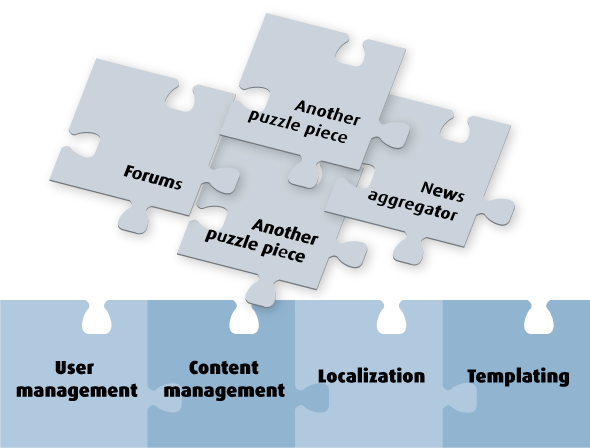
June 7, 2004 - 03:26 : kika
Attachment: http://drupal.org/files/issues/kika.drupal.puzzle.1_0.png (0 bytes)
------------------------------------------------------------------------
June 7, 2004 - 03:25 : kika
Attachment: http://drupal.org/files/issues/kika.drupal.puzzle.1.png (61.27 KB)
My take on "Drupal diagram", started on
http://buytaert.net/temporary/drupal-poster.jpg
What pieces should be "foundation" and what "flying pieces"?
------------------------------------------------------------------------

June 7, 2004 - 03:12 : mda

Here is a quick draft of some content: ------

Drupal Is:

Free:

Drupal is licensed under the GPL, making it free for anyone to use and
customize.

Supported:

There is an active developer and user community that participates in
mailing lists, forums (driven by drupal of course), and IRC.

There are several consultants that offer paid support and development
using drupal, and several ISPs that specialize
in hosting drupal sites.

Powerful:

There are over a 100 modules in the standard release and contributed
areas combined. These
include such applications as:

Forum
Calendar
Blog
Image Gallery
Moderated story discussion
Static pages
Collaborative book authoring
News aggregation

Cutting across these modules are core architectural services such as:

search
menus
module configuration
internationalization
content categories ("taxonomy")
authentication and access control
themes

Flexible:

The site administrator can pick and choose between which of the many
modules to enable.
She can also customize the style and layout almost without restriction,
positioning
the dynamic "blocks" at will.

Standards Compliant:

Our generated sites are XHTML compliant, and leverage CSS for styling.
We can read and generate RSS.

Portable:

Uses PHP, with MySQL or Postgresql.

Well-Engineered:

We aren't afraid of you looking under the covers at the source code.
We generate API documentation directly from our source code.
We bring out formal releases with QA regularly enough that
non-developers are not driven to rely on CVS.

------------------------------------------------------------------------

June 7, 2004 - 02:07 : kika

Attachment: http://drupal.org/files/issues/kika.drupal.booklet.1.pdf (75.84 KB)

fixing the attachment

------------------------------------------------------------------------

June 7, 2004 - 01:53 : kika

Attachment: http://drupal.org/files/issues/kika.drupal.booklet#1.pdf (75.84 KB)

Here's my first take. DO NOT check the content, just give +1 or -1 on
the design direction.

Some of my suggestions:

- use cutouts or blockquotes to emphasise certain facts (GPL in my
example). They also live up the text-centric pages.

- list of Drupal sites: quality, not quantity. Explain certain site

types and provide 1-2 examples. People rarely type urls from paper-based materials,
so just make sure
you provide a quicklink on bottom of the page (drupal.org/sites or

drupal.org/casestudies).

- as you can see, we can not list too many features (if we provide
descriptions for them). Again, quality is essential. Just list the
"unique" or "better-than-others" features.

- People like screenshots, even in print.

------------------------------------------------------------------------

June 7, 2004 - 00:03 : killes@xxxxxxxxxxxx

Attachment: http://drupal.org/files/issues/leaflet.pdf (119.59 KB)

Next one.

------------------------------------------------------------------------

June 7, 2004 - 00:01 : killes@xxxxxxxxxxxx

Attachment: http://drupal.org/files/issues/drupal.pdf (254.16 KB)

There have been a lot of discussions on #drupal about what to present to
people.

There are two sketches of leaflets available which serve to collect
ideas.

I am uploading them to get more views on this.

------------------------------------------------------------------------

May 25, 2004 - 22:43 : killes@xxxxxxxxxxxx

We need to discuss how Drupal should be presented: "Only" as a very
versatile tool or should we take the community aspect into account? I
tend to omit most of the community stuff. jluster indicated that many
visitors will be suits and we should maybe translate "community" to
"employees" or "company".

------------------------------------------------------------------------

May 25, 2004 - 22:39 : killes@xxxxxxxxxxxx

The poster should be 1m wide and up to 2 m high. It should be in
PostScript so that I can print it. I just discovered a LaTeX-class that
I'll investigate: http://www.infodrom.org/download/fancyposter.tgz

The text of the poster needs to be in German (for the current
purpose).

Ber Kessels has a graphics friend who has offered to help.

I wouldn't mind to get some ideas what to explain or demonstrate about
Drupal.

------------------------------------------------------------------------

May 14, 2004 - 18:58 : killes@xxxxxxxxxxxx

The poster or leaflet should show what makes Drupal special and
different (= better) than our competitors. We should mention the areas
where we are very good (rss and friends, modularity, good caching for
anonymous users (=> no /. problems)) or do not even have competition
(taxonomy).